Bitcoin UTXO Stats
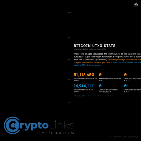
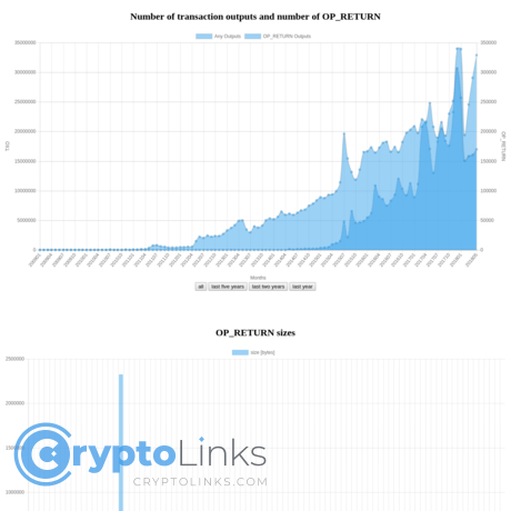
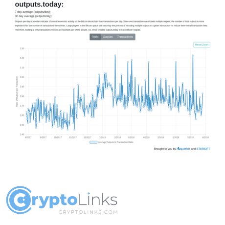
Bitcoin UTXO stats provides a visualization of unspent transaction outputs on the bitcoin network (from 2010 to present). The visualization is divided into two and consists of pixels on a chart against time (where the pixels are representing Bitcoin blocks). The first section of the chart shows unspent transaction outputs per block and the second shows the combined value of Bitcoin in those outputs. This is a very interesting visualization as you can see how unspent transaction outputs cluster up at certain times of the year. It also shows how Bitcoin has increased in popularity over time with clusters increasing on a huge scale in the latter half of 2017. The visualization highlights the scalability problem of Bitcoin. It shows Bitcoin has struggled to keep up with transaction volume demand as it has increased in popularity. The website is free to use but it very limited. It consists only of this visualization and some metrics which total unspent outputs in all blocks, total unspent Bitcoin in all blocks, maximum unspent outputs in one block, unspent Bitcoin in the most valuable block, unspent outputs in the last block, and unspent Bitcoin in the last block. There is a donation for users who wish to contribute.